Thursday, October 17, 2019

Build Your Own Floral Bouquets

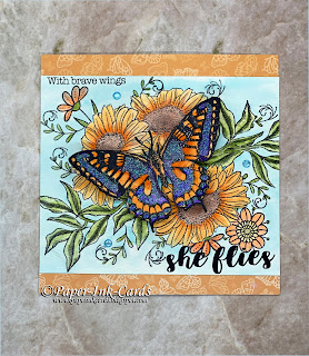
One of my favorite things to do in cardmaking is to stamp my own floral arrangements like I have done on today's cards.

I love to mix and match individual floral and foliage stamps to create a layout for the focal point of my cards.  It is so satisfying and no matter how many times I use the same images each composition is always unique.

The secret of being able to build bouquets like these is masking, a basic stamping technique that will make your work look like art.  Masking lets you layer stamped images over each other creating depth to your design.  In this case it will appear that there are flowers and leaves in the background as well as the foreground.  

Step-by-Step Tutorial

What you will need are some images of your choice, masking paper, scrap paper or Post-It Notes, scissors, temporary glue, stamping ink, stamping block or stamp press and cardstock.

Begin by stamping the first of your largest images onto your cardstock and then without re-inking, stamp that same image onto your scrap paper.  There should be plenty of ink still on your stamp for this.  Now fussy cut out the image stamped on the scrap paper, getting as close to the outline as possible.  Add some removable glue or tape to the back and lay it over top of the image on your card making sure the image is completely covered.  This is where masking paper or Post-It Notes come in handy, they are already sticky.  If you use a regular Post-It Note be sure that you stamp part of your image up near the edge where the sticky is on the back.  You can also find all over sticky Post-It's that work really well for masking.  Another masking option is to use masking fluid but it takes time to dry so I like using paper masks.

Next stamp another image or the same image allowing part of it to be stamped over the mask.  Now remove your mask and see how the second image appears to be behind the first.  Cool huh?  

Continue to do this with all of the elements that you want in your bouquet building up and around your original image.  In the cards above I used two or three of the same large floral images first then I added smaller flowers and foliage to fill in and complete the arrangement.  For the butterfly card, I made two masks of the sunflower so I could stamp the foliage between them and in the second card I created just one mask and moved it around between the two mums as needed.  Use as many masks as you want and when you are done, save them with your stamp set to use the  next time.  I typically reuse masks several times before I toss them out and create new ones.

Learning how to mask can open up a whole new love of stamping.  Give it a try, with just a little practice you'll be creating all sorts of scenes and using your stamps in ways you never thought possible.

Thank you for visiting,
Dawn

All products used are my own and purchased by me.  My blog posts, videos and opinions are not sponsored, and I am not paid by the product companies to create these posts and videos. 


Thursday, October 3, 2019

Where Has This Year Gone?

It's Fall Y'all and that means cooler weather and glorious colors.  Raise your hand if you love fall!  For ten years I lived in the Midwest and nothing beat the changing of Summer to Fall; well except maybe the ice covered trees in winter which looked so much like the trees were made of crystal.  What glory nature can bring.  

I now live in coastal southern California and I don't get to enjoy the changing of the season quite as much but I always try to bring the memory of the beautiful Autumns that I enjoyed so much into my stamping.  

This year I have been creating cards using the Autumn Splendor Card Kit from Gina K Designs.  Gina K's fall kits are always my favorite and this year's kit does not disappoint.  It includes two sets of stamps, one is a layered leaf stamp set the other has large cone head daisies, its foliage and also some nice sentiments.  Also included in the kit are a number of dies for cutting out the stamp images, a mandala stencil and several pieces of cardstock ready to create mats and layers or card bases.

For these first cards I used Midas metallic ink pads by Spectrum Noir in Red Garnet and Jade Green and a variety of the leaf stamps from the Layered Leaf Prints stamp set.  I randomly stamped the largest leaf by dabbing ink of one color around the edges of the stamp and then the other color in the middle to create an autumn leaf color changing effect.  Then I filled in the background with some of the other leaves in solid colors.  These metallic inks are so vibrant on white cardstock, a little bit of matting and layering, add a sentiment and my cards were done.


This next card I used the same inking technique but stamped on black cardstock.  The black card shows more of the metallic in the inks and less of the vibrancy which made for a nice soft background to the Cone Head Daisy flower stamp.  I colored my daisy in shades of yellow for a fall sunflower feel and added a simple black and white sentiment.


This time using the Midas metallic inks in Jade Green, Blue Organza and Amethyst, I inked the mandala stencil onto white cardstock.  The inks are pigment inks so they remain wet for quite a while which allowed me time to heat emboss the ink with clear embossing powder creating an enamel look to the mandala.
 
To complete the card I cut the mandala in half and used a scallop edge die to create my focal point, I dry embossed a piece Plum Punch cardstock from the kit using the Studded Leather 3D embossing folder by Crafter's Companion, added a simple sentiment, a few jewels and a couple butterflies.


I hope you've enjoyed a little bit of fall fun and warm colors with me today.  I'm telling you, this kit is packed with lots of great inspiration.  You have to check it out!  

All products used are my own and purchased by me.  My blog posts, videos and opinions are not sponsored, and I am not paid by the product companies to create these posts and videos.   Thank you for visiting.


Until next time, happy crafting!

Dawn


Wednesday, September 11, 2019

Letter Pressing with Foil Stamp Die

Hello Crafters, 

Today I have a quick tip video tutorial showing you how I used a Hot Foil Stamp Die to letter press with.  It's quick, easy and a fun way to get more mileage out of those dies.  


These are the cards that I made with the backgrounds created filming this video.  Turned out nice.


I hope you enjoyed the video.  If you have any questions or comments please leave them below.

Thank you for stopping in.

Happy crafting,
Dawn

Disclosure:

     All products used in my blog posts and videos are my own and purchased by me.  My blog posts, videos and opinions are not sponsored, and I am not paid by the product companies to create these posts and videos. The information provided in is my own personal endorsement and choice.

Thursday, August 22, 2019

Paper Pine Bow Wreath Card Topper

Hello,


Yesterday I shared a video on how to make a Center Step card from scratch and today I am back to show you how I embellished my card with a wreath made from paper.
You can create a wreath like this using any branch, twig or leaf die that you have in your crafting stash.  You can even scale this wreath up to one large enough to use as home decor if you have an electronic die cutting machine.

Thanks for visiting and please stop by again for more card making inspiration and techniques.  

Until then...Happy Crafting!
Dawn

Disclosure:


     All products used in my blog posts and videos are my own and purchased by me.  My blog posts, videos and opinions are not sponsored, and I am not paid by the product companies to create these posts and videos. The information provided in is my own personal endorsement and choice.

Tuesday, August 20, 2019

Quick but Elegant Christmas Cards using Designer Papers


Hello, I am back again with some easy but elegant Christmas cardmaking inspiration.  These cards were all made with a new assortment from Crafter’s Companion called Poinsettia Perfection which is part of their Nature’s Garden collection. 

This first card is a traditional 5x7"card layered with beautiful patterned paper from the 12x12" paper pad included  in the collection, a die cut frame using the Victorian Frame die and a couple of paper poinsettias.  I cut the frame from a foam green glitter card and using the Grande Poinsettia die set I cut multiples of the petal layers out of white glitter cardstock.  I gently shaped the petals and assembled the flowers in layers.  The card all came together by layering a couple of flourishes cut from some patterned paper that I had in my scrap paper folders.  I adhered those on top of the frame, then the two poinsettias, their leaves and finally a ready-made sentiment.

This next card began with a 5x5" card base in which I scored the front of the card at 2 ½ inches and folded it back onto itself.  I adhered pieces of patterned paper from the paper pad, then I stamped, die cut and colored the Victorian Lantern stamp from the collection.  Finally a card topper sentiment that is part of the same paper pad was added to the front and I stamped a holiday sentiment on the inside.

For this final card, 
I created a center step card base and covered it with the designer paper.  I embellished with another paper poinsettia, this time cut from some of the designer paper, added another flourish and some leaves.  Finally, a little bling to dress it up and another ready-made sentiment.  If you would like to learn how to make this type of card base, please here for step-by-step tutorial.
This new Poinsettia collection is gorgeous and has so many wonderful elements that you won’t need anything else but glue and some inspiration to make memorable cards this holiday season.  The collection is currently available as a bundle on HSN.com or you can purchase the individual pieces from Crafter’s Companion’s website. 

I hope you will stop by again for more card making inspiration and techniques.  

Until then, Happy Crafting!
Dawn


Disclosure:


     All products used in my blog posts and videos are my own and purchased by me.  My blog posts, videos and opinions are not sponsored, and I am not paid by the product companies to create these posts and videos. The information provided in is my own personal endorsement and choice.


Friday, July 26, 2019

Same Stencil – Three Different Looks


Welcome back!  Today I have three cards that I made with simple stencil techniques, but all three cards have a different sense to them.

This first card, I used the stencil to create a cool underwater effect.  I stenciled a medium blue ink onto white cardstock then after removing the stencil, I inked all over the entire piece with a lighter blue ink.  This softened the stark white that was left by the stencil.  I finished by stamping a scene with silhouette stamps of underwater fish and seaweed in solid black, then added some die cuts and a sentiment.

For this project the same stencil was used but this time it was inked with an embossing ink onto a light blue paper then clear embossing powder was heat set on top.  This provided a shiny textured finish.  Imagine doing this on tan paper, I think you’d get a neat croco-embossed effect.  To complete the project, I layered the embossed background with a simple sentiment that I shadow stamped a butterfly over.  This technique, I have often seen on wall art, but I have never done it in my paper crafting.  Thanks to Christine Mann, a member of a Facebook group that I am in, I was inspired to try it and I loved how the ink used for the butterfly matched the embossed background, so I made a small piece of art out of them.  Thank you, Christine!

The final card is a simple ombre of aqua inks stenciled onto white cardstock.  Again, nothing fancy here but the effect is so striking.  To complete my card, I dry embossed a white card base for texture in the background then layered the stenciled piece with a colorful and glittery butterfly.  The sentiment is a die that leaves the wording as negative space and I love how it layered nicely onto of the stenciling.


I hope you will have a play with some of these easy backgrounds.  Isn’t it fabulous how one stencil with slightly different applications can change the look and feel of a project?

Now go forth and be crafty!

Dawn

Disclosure:

     All products used in my blog posts and videos are my own and purchased by me.  My blog posts, videos and opinions are not sponsored, and I am not paid by the product companies to create these posts and videos. The information provided in is my own personal endorsement and choice.

Wednesday, July 17, 2019

Looking for Inspiration in the form of a Monthly Craft Kit?


This past year you have watched me explore different cardmaking and crafting techniques and that is primarily because of a monthly subscription box from Crafter’s Companion via an autoship program through the Home Shopping Network (HSN).  These kits have really inspired me to do more techniques and because they are so comprehensive, they make it fun and easy!  

I’d like to share the following cards with you which were created with elements and techniques from the last two monthly boxes.  You can read more about these boxes and their contents here.  The boxes are only available by subscription in the US through HSN.  However you can occasionally purchase individual boxes from HSN or Crafter’s Companion. 

This pink and purple floral card was made entirely with elements from box #13, the Flower Forming Foam Kit.  It teaches us how to make flowers out of heat reactive foam.  The layers of the flowers were die cut using the included flower dies and the foam in the box. The rest of the card was assembled using a 6x6 card base, a piece of designer floral paper, a green mat layer, a sentiment die cut and ribbon all also part of the box.  Everything in these monthly boxes are always made to coordinate and makes creating cards like this simple and fun.

This Damask card was made using one of the ten stencils in box #14, the Stencil Craft Kit.  It was inked with a metallic rose gold ink pad from Spectrum Noir using a straight-forward ink-through stencil method.  The flowers were created with the same sheets of foam and cutting dies in box #13 mentioned above.  

This last card was created using another stencil from box #14.  Again, a simple ink-through method was used however, to create the different layers of color I used post-it notes to mask off sections, such as the green foliage which I covered while inking the purple flower.  Once the stenciling was done I trimmed and mounted the background layer onto a purple mat layer then mounted those onto a green card base and added a die cut butterfly and a sentiment to complete the card. 

Whether you are a beginning card maker or a seasoned one, I cannot recommend these boxes enough.  They are a great way to develop or practice your crafting skills and build your craft stash at the same time.  The value is amazing and always includes everything you need to learn the technique being highlighted.  Every box also includes extras such new stamp sets, dies, designer papers, layering papers, card bases, envelopes and more and only costs about $32 a month with shipping and handling.  

I know this sounds like a sales pitch, but enrollment happens just once a year and that time is now!  You can sign-up by purchasing the two boxes that I have used for these cards plus you’ll get box 12 for free.  I recommend signing up for autoship so you can receive all future boxes automatically.  If you are not satisfied with a box, simply send it back to HSN for a refund.  You can also skip or delay a shipment whenever you like, and each box is shipped to arrive around the first of the month.  You’re in control!

Let's get crafting,

Dawn

Disclosure:

     All products used in my blog posts and videos are my own and purchased by me.  My blog posts, videos and opinions are not sponsored, and I am not paid by the product companies to create these posts and videos. The information provided in is my own personal endorsement and choice.


Thursday, July 11, 2019

How to Create a Hand Designed Floral Garden Card with No-Line Coloring


No-line coloring has become a popular technique in water coloring, but it works well with alcohol markers too.  To achieve the no-line look, a very light-colored ink is used to stamp an image and as you color the image the outline seems to magically disappear.  It’s a cool effect.


Today’s project is completely handmade and does not have a single bit of designer paper.  It will have us exploring several techniques in one card.  It covers no-line stamping and coloring of course but will also include masking with a liquid masking agent; background ink blending; stamping and heat embossing on vellum; die cutting and card layering.

The supplies that I used for this card are:
  • 4” x 5.25” white cardstock (be sure to use the proper card for your choice of coloring medium)
  • 4.25” x 5.5” Green Card Base to coordinate with your green foliage
  • 2” x 6” strip of Vellum for the sentiment
  • Floral Stamps
  • Sentiment Stamp
  • Thin Border Die
  • Pale Colored Ink
  • Choice of markers or watercolors
  • Black Ink Pad
  • Versamark Ink
  • Fine Silver Embossing Powder
  • Anti-Static Powder Tool
  • Ink Blending Tool or Sponge Dauber
  • Masking Fluid
  • Preferred Glue
  • Die Cutting Machine

For my card, I stamped a floral spray image across the top and bottom of the white cardstock with GK Designs Whisper ink and I filled in around the spring with additional floral and leaf stamps until I was happy with the design.  You could change it up by stamping your images in the four corners instead.  However, you decide, leave empty space across the middle of your card for your sentiment and to create the black background.

Now have fun and color your images.  For my design I started with Copic Y02 flicking it out from around the center of each flower, then I blended that out with flicks of Y00 and finally brought Y000 from the petal edges in toward the medium shade.  I went back in with Y02 to deepen as needed.  The stamen of my flowers were colored YG91 and a black pen for the specks. The foliage was colored with YG25, Y23 and was finished by blending all together with Y21. 

Now it’s time to mask your beautiful coloring.  Coat all your artwork with the masking fluid and let it completely dry before moving on.  If you have watercolored your images, be sure to let your piece dry thoroughly before applying the masking fluid.

Once the masking fluid is dry, sponge the background black using a good black ink that blends well.  I used GK Designs Black Onyx because her inks have a leveling agent that creates a beautiful smooth finish.  With a sponge dauber, or your favorite blending tool, begin swiping ink onto the card starting on the outside and work your way toward the middle completely covering any white areas.  The masking fluid will resist the ink and protect your design.  Repeat your blending until the background is a nice rich black.  Be sure your background ink is dry before moving on.

Now it’s time to remove the masking agent.  Gently rub the masking fluid with your finger, the masking agent will ball up and peel off revealing your gorgeous design.

Next prepare the vellum sentiment strip.  I used a premade sentiment for my original card, but I will walk you through creating your own from scratch.  Start with a 2” x 6” strip of vellum that has been rubbed all over with an anti-static tool, stamp a sentiment with Versamark, coat with a fine silver embossing powder and heat the powder until it is all melted.  Let cool before die cutting the edge. 

With a thin border die, cut a fancy edge along the top and bottom of the vellum strip.  Trim away the excess bits at the top and bottom that the die cut away but do not cut the extra vellum on either side of your sentiment.  You’ll use this excess to adhere the strip to your card.

Time to assemble your card:  Start by centering the vellum strip across the front of your floral design layer.  Fold and adhere the left and right side of the vellum to the back your layer.  Doing this, you will not have any glue showing through the vellum on the front of your card.  Now center and glue your design layer to your card base.  If you like, you can use some foam pads or a layer of fun foam to give your design layer height. 

Finish the inside of your card to harmonize with the card front.  I chose to use a 4” x 5.25” piece of white cardstock on the inside and I stamped a flower and some leaves in the lower left and upper right corners and colored them to match the floral images on the card front.  Finally, you can stamp a greeting inside or handwrite a personal note. 

Now go show your husband your beautiful finished card so he can see why you need all of those craft supplies.  ;-)

I hope you have enjoyed today’s step-by-step tutorial.  Please leave any questions or suggestions in the comments.  I love to hear your ideas!

Happy coloring,
Dawn


Disclosure:

     All products used in my blog posts and videos are my own and purchased by me.  My blog posts, videos and opinions are not sponsored, and I am not paid by the product companies to create these posts and videos. The information provided in this video is my own personal endorsement and choice.

Tuesday, June 25, 2019

Easy Nautical Cards


It’s no secret that I love the beach and the ocean, there is just something mysterious and magical about it.  Its beauty and its power are so inspiring to me.  Perhaps that is why I make so many beach scene and nautical cards.  I think they are perfect for just about every person and every occasion.

If you follow me on Pinterest, you also know that I love Crafter’s Companion products, so when they released a nautical collection earlier this year I jumped at the chance to buy it.  The collection has everything from dies to stamps to coordinating paper and much more!  Below are some of the cards that I have created using primarily elements from the Sara's Signature Nautical Collection by Crafter's Companion. 

I call this card Seahorse Through the Porthole.  Wouldn’t it be fun to be on a ship and look out your porthole and see this little guy floating by?  Oh my!  

To make this card I used a 5.5" square card base and one of the included embossing folders.  I inked up and embossed the folder in letterpress fashion then layered and matted it onto navy cardstock.  On top of the embossed panel I cut one of the layers of the porthole dies and cut the seahorse.  I foam mounted the porthole onto the background layer and cut the sea horse’s tail off to have him popping up into view.  I foam mounted his head but glued his lower half flat giving him a little movement.  To finish off the card I die cut one of the included seashells, two of the coral pieces and layered them beside the porthole.  For added movement I had some waste strips of cardstock from another project that needed to be trimmed down a hair and because the trim was so thin, the cardstock curled on its own from the friction of the paper trimmer and I felt the spiral curl was perfect to add texture to this card.  Something fun to think about before you throw away those scraps.  Finally, to finish this card I added some little bubble elements I found at a local store and a die cut sentiment.  I just love this card! 

This is another card that I made from the collection.  It came together quickly using some of the designer papers and a few of the stamps that are included in the collection.  I began with a 5"x7” card base in white and adhered a piece of the designer paper to cover the card front.  Then I cut two more pieces of the designer paper one at 3 3/4” square and the other at 3 1/2" and mounted them offset with the larger layer set on an angle.  I stamped the lighthouse, the tall ship and a couple of the sea gulls in flight and colored those with markers then fussy cut them.  I also stamped one of the sentiments in the bundle and added a die cut anchor, a piece of twine and this card was done.  I have had several comments from people who think this card looks like a store-bought card.  I take that as a compliment, but the collection should really get the credit.

Finally, I want to share this card with you

This card is made on a kraft card base that is 5"x7" layered with a background die cut of wood slats from another piece of kraft cardstock.  I inked both the die cut and the card base with a dark brown ink to enhance the distressing and to add interest.  Behind the wood slats I layered a piece of the designer paper in blue to bring a water vibe to the card.  On top of that layer is the porthole.  I cut two of the outer rings of the porthole set of dies and the inner window from gold cardstock alternating shiny and matte finishes.  Then I foam mounted the two inner levels of the porthole to a printed sunset image that I found on the Internet.  The image is free and has a public domain license.  Finally, I added the wood post, the seagull,  the sentiment, a few starfish embellishments and a couple more flying seagulls to complete the card.  I think this would be a great masculine card.

Thank you again for stopping by and spending some time with me today.

Dawn


Disclosure:

     All products used in my blog posts and videos are my own and purchased by me.  My blog posts, videos and opinions are not sponsored, and I am not paid by the product companies to create these posts and videos. The information provided in this video is my own personal endorsement and choice.


Wednesday, June 19, 2019

Creating Surf on Your Cards


I love creating beach scene cards likes these


Have you seen cards like these and wished that you could make one?  There are stamps that you can buy to create the surf and though they are wonderful, there is just something extra special about making the surf from scratch.  A sense of wonder, a feeling of pride, I’m not sure what it is but I’m going to walk you through it so you can give it a try for yourself and see what I mean.  Best of all, it’s super easy to do so let’s get started.  (Click on the video below for step-by-step instructions on how to create scenes like this.)


So, what did you think of this process?  Did I walk you through it well enough?  Will you try this technique?  If you create a beach scene of your own, please share it with me on my Facebook Page

Here is an image of my final card once I had gone back and added a few springs of plant or seaweed and another small seagull cruising along the top of the water.

Don’t forget to finish the inside of your card by bringing one of the elements from the front to the inside.  Perhaps a starfish and a swash of blue ink behind the sentiment that you put inside.  I chose an anchor to represent my sentiment.

I hope you enjoyed the video and this post.  Thank you for stopping by and spending some inky time with me today.

Dawn


Disclosure:

     All products used in my blog posts and videos are my own and purchased by me.  My blog posts, videos and opinions are not sponsored, and I am not paid by the product companies to create these posts and videos. The information provided in this video is my own personal endorsement and choice.


Wednesday, March 20, 2019

Simple Tricks to Get You Started


Do you struggle getting started with a new project?
Do you feel that your handmade cards lack something?
Do you want to create more interesting cards like this gorgeous floral card?  


Well today I have a few tricks to share with you.

When starting a project, begin by deciding on a theme.  I don't mean a theme like birthday, get well or anniversary.  No, I mean do you want to make a floral card, a scenic nature card or perhaps a car themed card?  You will also want to think about whom the card might be for.  Let's say that you are going to be making a card for your brother's birthday, you will want to personalize it, so choose a theme that interests him, like golf perhaps.  Right away I bet you have a vision in your head about what should be included on a golf themed card, don't you?  Write those ideas down and sketch out your design if it helps, that way you will have a road map so to speak, to work from.

Next think about a color palette.  When choosing your color scheme try to think of ways to incorporate unusual color combinations like the peonies in the card above.  Teal and purple flowers are not the normal color palette you would think of but look at how dramatic the colors make this card.  Test your color combinations out on scrap paper.  Don't be afraid to be bold and experiment, if you don't like them it is just scrap paper you wasted.  A stamped image can be colored in with pens or pencils or you can "paper piece" an image using patterned papers.  Increasingly popular are layering stamps like the peony flowers above.  These stamps are designed so that you stamp each layer in a different shade of ink building upon the image with each stamp to create realistic images.  
Well, that is if you use realistic colors.  😇😇  

You can also add even more interest to your cards by creating focal elements by stamping or printing them onto a separate piece of paper and cutting them out to arrange in varying heights using pop dots or dimensional foam when adhering them onto the card front.  

Another great addition to a card is texture.  Embossing folders are great for creating texture in the background.  They don't cost a lot of money to buy and they can be used again and again and again.  To enhance the texture, highlight the raised parts of the embossing with inks or waxes.  This simple trick will really make your background stand out and give depth to your design.  

Finally be sure to incorporate just a few more techniques to make your cards look more polished and professional such as mat-and-layering the card front and sentiment; running a black marker (or a coordinating color) along the edges of your cut out images so the white paper core of your elements won't show and be sure to tie the theme and color scheme of your card front to the inside of your card.  These little touches really make a difference.

For extra credit, add some embellishments such as crystals, glitter, buttons and bows.  The sky is the limit when it comes to special touches but be mindful of postage if your card will be mailed.  Also consider adding a piece of cardstock on top of your card in the envelope to protect it from the postal machines that your card will undoubtedly pass through.  

Remember all of these tips and tricks can also be used on scrapbook layouts.

I hope these simple design tips have helped you get started on your next project.

If you've enjoyed this blog post or have any questions, please leave a comment below.

Thanks for stopping by.
Dawn

Disclosure:
     All products used in my blog posts and videos are my own and purchased by me.  My blog posts, videos and opinions are not sponsored, and I am not paid by the product companies to create these posts and videos. The information provided in this video is my own personal endorsement and choice.


Monday, December 3, 2018

Merry Christmas and Happy Holidays and a Few Cute Cards for You


Isn’t it funny how the holiday season can have such a global impact on our lives?  Some people literally gleam with the spirit of Christmas.  It’s just magical.

My first card today is an aperture card of Santa and his reindeer flying through the winter night sky while my pal Frosty holds up his wooden sign pleading for Santa to stop. 


For this card all the elements were from Crafter’s Companion.  I cut the tree scene with the Evergreen Trees die by using a cut-off-the-edge technique so only the tops of the trees were cut into the card but not completely cut out from the card.  Then I used one of the Torn Edge Rectangle dies and again “cutting-off-the-edge” to cut the rest of the window opening.  I stamped, colored and fussy cut out the snowman from the Winter Wonders stamp set and the sign from Santa’s Secret set.  I glued the sign to the snowman’s stick arm and glued him to the card front.  The sentiment “Do you Believe” is also included in the Santa’s Secret set.

For the inside I used watercolor cardstock, a sponge blending tool and blended ink in shades of light blue purple and dark blue masking off for a full white moon.  I used some various tree stamps to stamp the black silhouette trees on the inside and finally I stamped Santa and his reindeer flying through the sky using the Magic and Wonder stamp. 

Next up is another Santa and his reindeer scene again using the same Magic and Wonder stamp to make a diorama card. 


To create this card, I used will need a piece of navy blue cardstock 5” x 9 1/4”.  I scored from the left edge with the piece of cardstock in landscape position at 1 1/4" and 2 1/2" then flipped the cardstock 180 degrees and scored again at 1 1/4" and 2 1/2".  Folding in at the 2 ½” score line and back at the 1 ¼” score line on both sides I created the basic card shape and base.  You can decorate right onto your card if you’d like but I chose to mat and layer the various sections.  I started my layers with plain white cardstock that was the same 5” x 9 ¼” size.  Using a sponge blending tool I blended three shades of blue and some black ink to build the night sky leaving part of the cardstock white for the snow and again masking for a full moon.  Once my background was done, I cut the layers from it by cutting two strips of 1 1/8” from each side and then trimming the remaining middle section just a hair so it would layer inside the card but allow the sides to still fold down. 

For the front joining snow bank I simple cut a wavy line with a craft knife and the houses and trees were cut from the Crafter’s Companion Sleigh Accessories Pack that goes with a Dimensional Stamp and Dies set.  These are dies that do not have a bottom cutting edge so when they are cut they are still attached along the bottom and I cut them so they were on a strip of cardstock cut to fit inside the middle section of my card.  I created two layers one with the trees and one with the houses.  I cut a few more trees and a house for the front of the card.  I also cut some snowflakes and a star for one of the trees.  Finally, I stamped the Magic and Wonder stamp on the center panel and glued all the pieces in place.  I used a white gel pen to add some falling snow.  

The best thing about this card is it folds flat to fit into a standard card envelope for mailing!  

My last card today is a quick and easy Aperture card.


The card was created with the Winter Wonderland Signature Collection by Sara Davies from Crafter’s Companion.  The card is a 6x6” card base layered with designer paper from the Winter Wonderland 6x6” paper pad.  These papers are so gorgeous that all the card needed was a few simple embellishments.

I cut the front aperture using the mat layer die from the Yuletide Sentiment die set.  I also cut out the sentiment die itself from mirrored blue cardstock and glue it to the inside through the opening in the front of the card.  The snowflakes were cut from silver mirror card with the Snowflake Quartet dies in the collection.  I glued some clear gems onto the center of the snowflakes and used gold and silver Stickles to add bling to the center of the flowers.  I added a bow tied from some ribbon that I found at the dollar store had and finished the inside with another piece of paper from the same paper pad. 

I hope you enjoyed today’s projects.  If you have any questions, please leave them in the comments sections below and thanks for stopping by.

Merry Christmas and Happy New Year!  May you and your family be blessed with good health, joy and peace.

Dawn

Disclosure:
     All products used in my blog posts and videos are my own and purchased by me.  My blog posts, videos and opinions are not sponsored, and I am not paid by the product companies to create these posts and videos. The information provided in this video is my own personal endorsement and choice.